Trady — Interface
Refocusing a trading terminal around how memecoin traders find, assess and act.
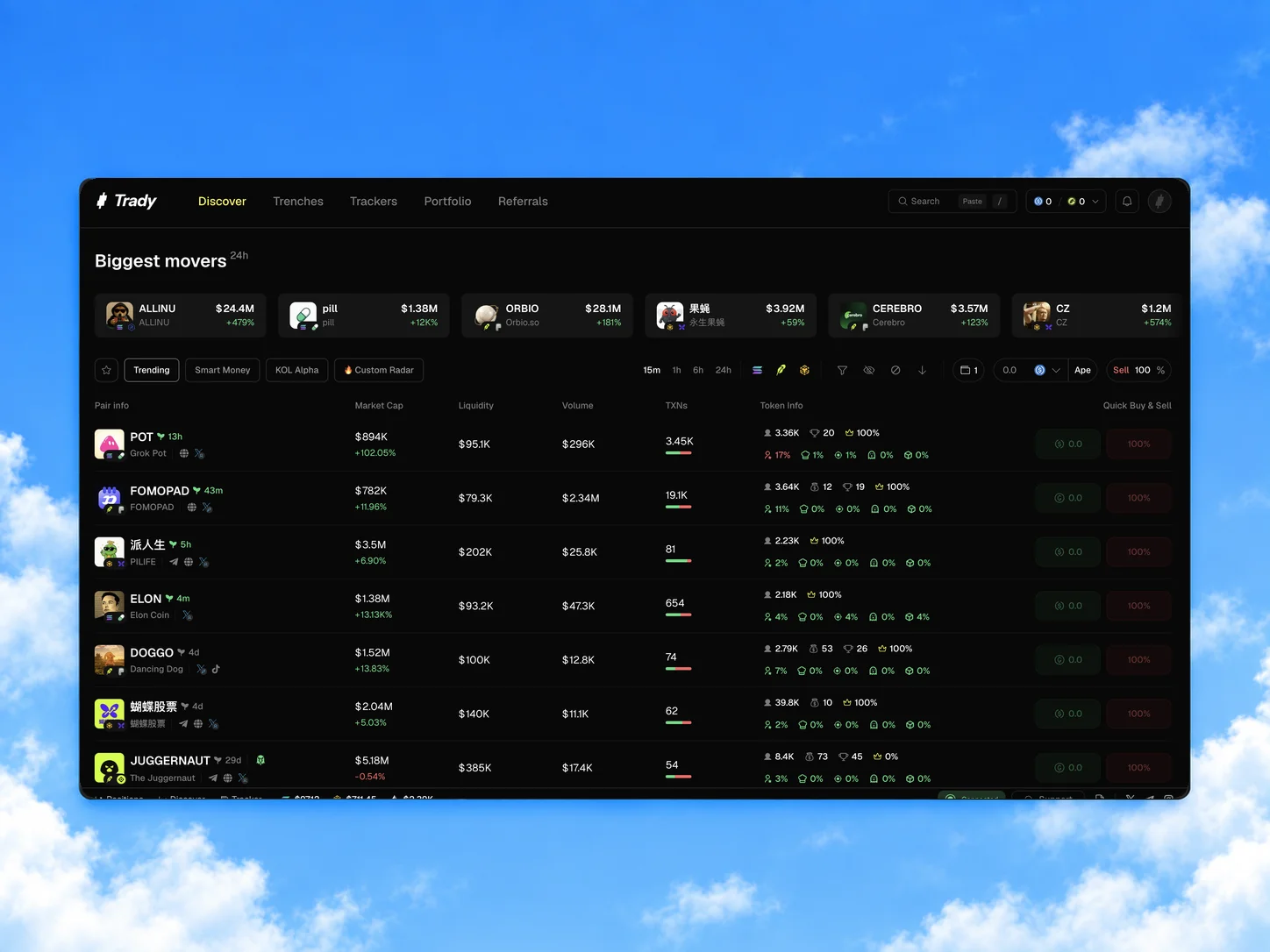
After Early Access feedback that V1 felt overloaded, Trady refocused on active memecoin traders. I led the V2 redesign and rebrand, and designed Discover and Trade end to end.
View live product ↗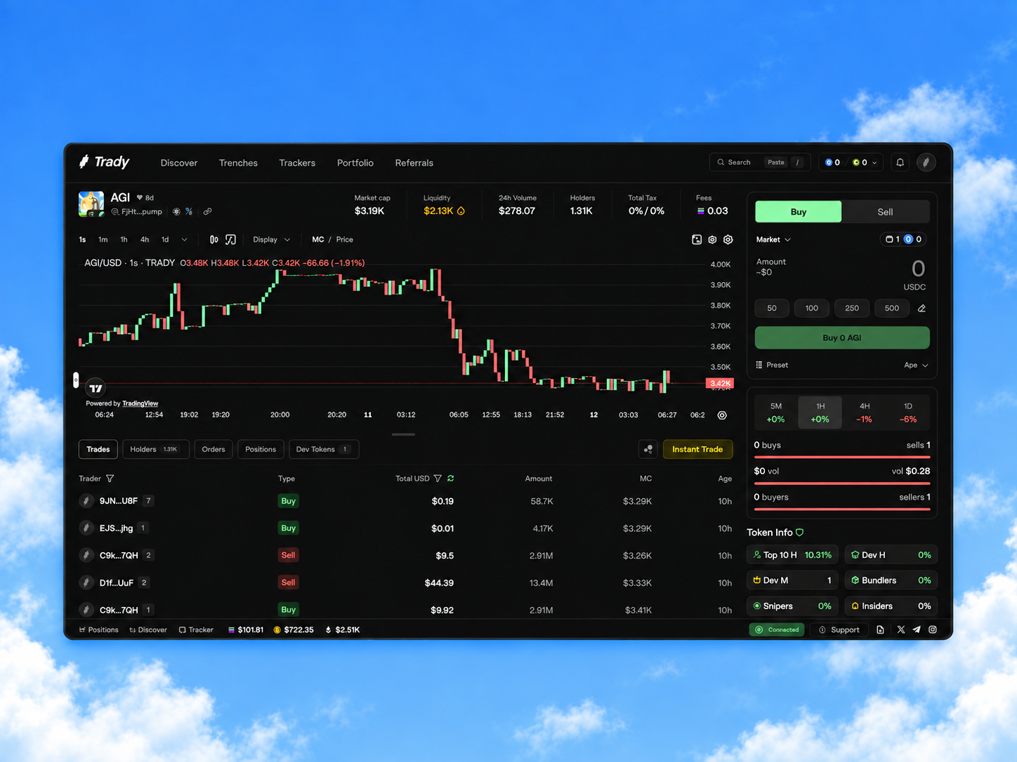
Trady is a non-custodial, cross-chain trading terminal. V1 was a customisable, modular terminal for a broad crypto audience.
Early Access feedback in March 2026: the interface felt overloaded and hard to scan.
The CEO narrowed V2 to active memecoin traders — more frequent trading was the business bet.
The V2 journey, shaped with the CEO.
As a hands-on Design Lead, I designed the core trading surfaces myself and led a team of two senior product designers and a graphic designer, working directly with the CEO and CTO. My goals were to:
- Set up design processes that would get the product to release.
- Improve the speed and consistency of design delivery.
- Set up an AI-assisted design workflow.
V1 — Organising the work for early access
- Reorganised Figma into three files: design system, work in progress and approved designs.
- Reviewed existing flows with the CEO and CTO, closed design gaps and designed parts of V1.
- Established regular design reviews, syncs and engineering handoff.
- Worked on the design system and hired a dedicated designer for it.
V2 — Product design and leadership
- Shaped the main user journey with the CEO: find → assess → act.
- Designed Discover and Trade, including the trading module, end to end.
- Worked on the rebrand with the team and ran daily design reviews.
- Set up the AI-assisted design workflow and coordinated engineering handoff.
Prepare V1 for early access
I joined pre-launch, when the CEO managed designers directly and there was no design process. With the CEO and CTO, I audited V1 for missing work and technical constraints before release.
Early access and audience pivot
V1 entered Early Access; the feedback that it felt overloaded led to the focus on active memecoin traders.
V2 redesign and rebrand
We redesigned V2 around find → assess → act and rebranded in under two months, with daily design reviews and an AI-assisted workflow.
Handoff and release
My involvement ended in June, after design handoff. A part-time designer supported implementation, and V2 was released in August.
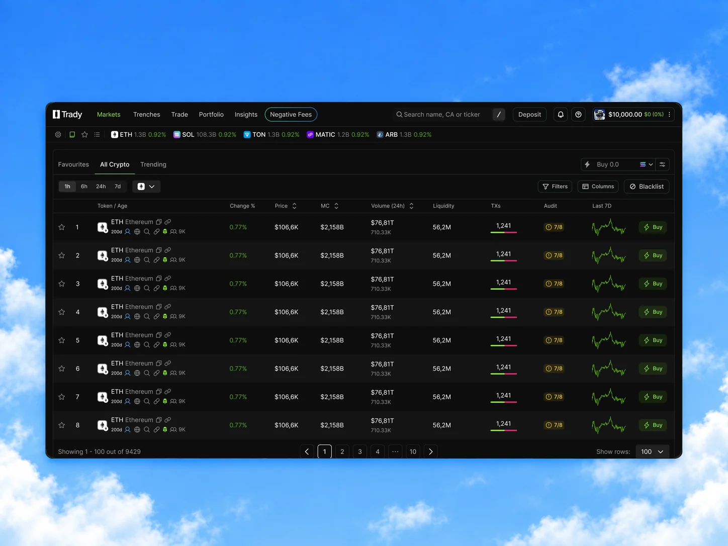
V1 Markets gave space to market-wide sentiment, price and a 7-day chart, and squeezed risk into one Audit score behind a hover. The goal: spot, judge and act on a token without leaving the list.
How we decided: our V1 audit against the new audience, Early Access feedback, my competitive analysis (Axiom as the main reference), the CEO's AI-assisted wireframe and our trading advisor's review. Several options went through advisor review and iteration before the final direction was aligned with the CEO.
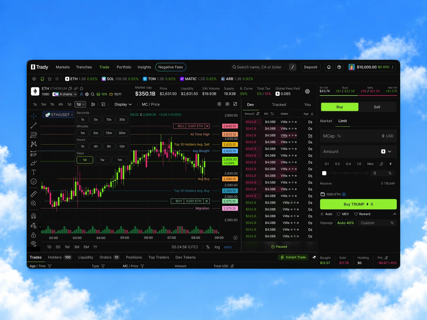
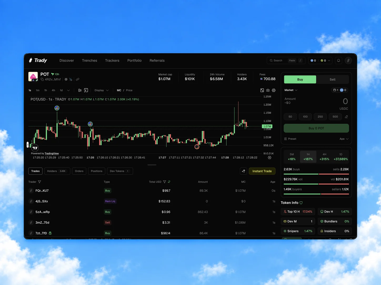
My main piece of work. V1 put many controls on the same level as the order flow, so I sorted each by frequency × criticality × persistence: what changes on most trades stays in the primary flow, occasional settings move a level down, and set-once choices become presets.
How we decided: CEO and product input, sessions with our trading advisor to challenge the domain logic and find the minimum information needed during execution, patterns from other trading terminals, and technical constraints.
How we used Claude Code during the redesign — from an initial wireframe to refined UI in Figma. AI made the starting points faster; screen logic, design decisions and final quality stayed with designers.
A — Define the direction
- 01
Inputs
The existing screen, competitor references and V1 Early Access feedback.
- 02
Initial wireframe
The CEO used Claude Code to combine the inputs into a low-fidelity draft.
- 03
Joint review
The CEO and I discussed and refined the screen logic before any UI design.
- 04
Design ownership
I designed the screen myself, or briefed a designer on its logic and reviewed their work.
B — Build and refine the UI
- 01
Manual foundation
Brandbook → Figma styles → a reference screen designed by the team.
- 02
Shared AI context
The brandbook and the reference screen guided Claude Code.
- 03
Working designs
Screens, sections and basic library components brought into Figma.
- 04
Iterate
Manual edits in Figma, alternating with further Claude Code prompts.
The reference screen was designed by hand first, so AI-assisted UI work built on an approved look instead of inventing one. Claude Code was most useful for small components and their states; complex trading screens still needed substantial manual design, and every output was reviewed before it reached the library.
Against my goals
Get the product to release
Designs were handed off at the end of the redesign; engineering built V2 with a part-time designer supporting implementation, and it shipped in August.
Faster, more consistent delivery
Before: the CEO managed designers directly, with no shared process. After: daily design reviews, a reorganised Figma, a shared V2 library and documentation.
An AI-assisted design workflow
Claude Code became part of the team's workflow for small components and their states, with every output reviewed manually.
What I delivered
ProductThese are delivery outcomes plus one qualitative signal. Decisions rested on the V1 audit, competitor analysis and a trading advisor's review rather than user testing, and impact on trading, conversion or revenue wasn't measured. Next I'd track time from Discover to first trade, the share of trades via Quick Buy/Sell, and trades per active trader.
- Pick the audience before the interface. V1 was designed for everyone. V2 got clearer once we fixed one audience first — and KOL feedback turned positive.
- Removing is a design decision too. Not less information: V2 deprioritised whatever competed with the next decision — and risked hiding what some traders still need.
- Make time for research, even when time is short. A few quick tests with target traders could have validated key assumptions; advisor input and competitor patterns helped, but don't replace direct user feedback.