Trady — Interface
Redesigning discovery and trading for memecoin traders.
V1 translated the founder's broad product vision into a trading interface without a clearly prioritised audience. I led the redesign of Discover and Trade — the product's two most-used surfaces — for memecoin traders specifically, while directing the wider design team on the rest of the product.
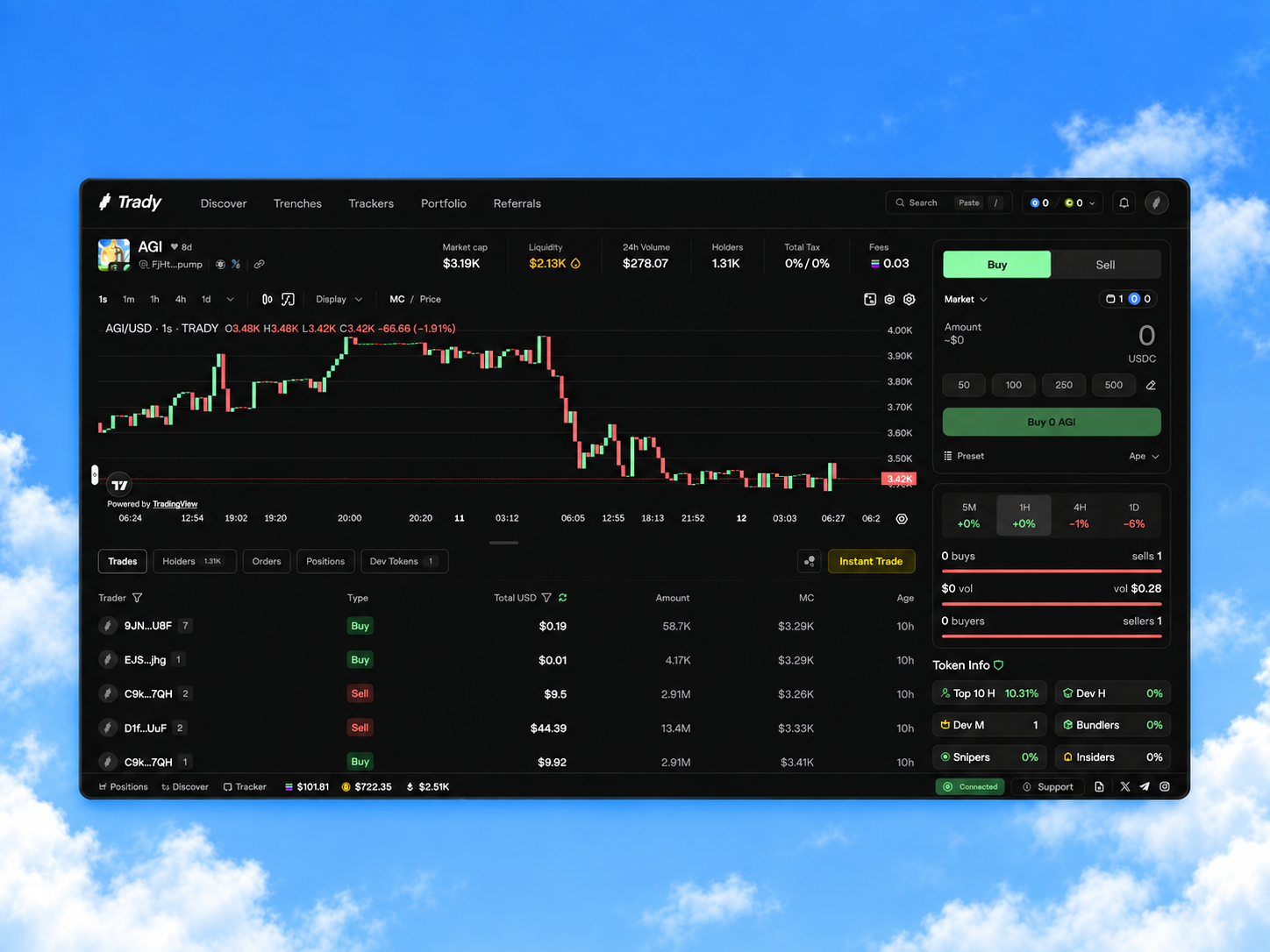
Trady is a non-custodial, cross-chain memecoin trading terminal — discovery, risk signals, execution, and portfolio management in one interface. V1 translated the founder's broad product vision into a trading interface without a clearly prioritised audience.
V1 served every type of crypto user without a clear priority. User feedback reached the design team through the founder, who relayed comments and supplied competitor research — not through direct user research.
For V2, the founder narrowed the focus to degen and memecoin traders — a specific audience to prioritise discovery, token-level evaluation, and execution around.
What active memecoin traders need from Trady, in fast-moving, data-heavy markets.
The connected workflow V2 preserves — no step should require losing context on the last.
The redesign centred on three connected decisions: making discovery actionable, bringing chart analysis and execution closer together, and clarifying cross-chain activity.
What I designed personally
Starting from the founder's low-fidelity layouts, I built the detailed UX/UI for Discover, the token detail page, and the trading module — the three decisions below.
What the team owned, I reviewed
The rest of the design team built the other product flows. I reviewed every screen for design quality and requirement coverage, and oversaw the design-system components, with a joint review alongside the CEO before handoff to engineering.
01 — Discover: making token evaluation more explicit
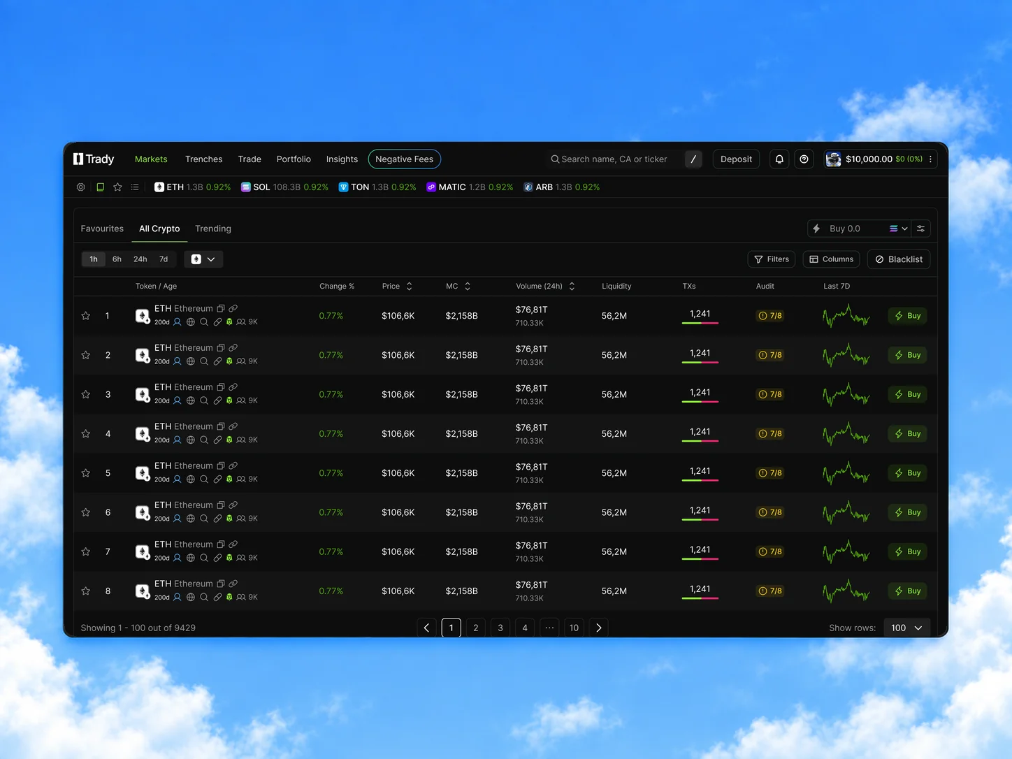
Markets showed a broad asset list with one aggregated Audit score and a Buy action per row. Buying was already easy — the surrounding discovery and evaluation paths weren't.
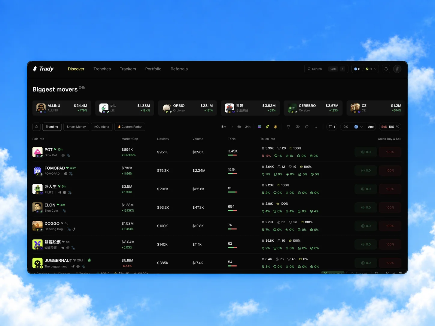
Discover splits the market into Trending, Smart Money, KOL Alpha, and Custom Radar, with Biggest Movers surfacing momentum. Individual risk indicators sit beside cap, liquidity, and volume — instead of one compressed score.
More specific discovery modes, visible token-risk indicators, and Quick Buy/Sell — the information around a trading decision is explicit, not hidden behind one score.
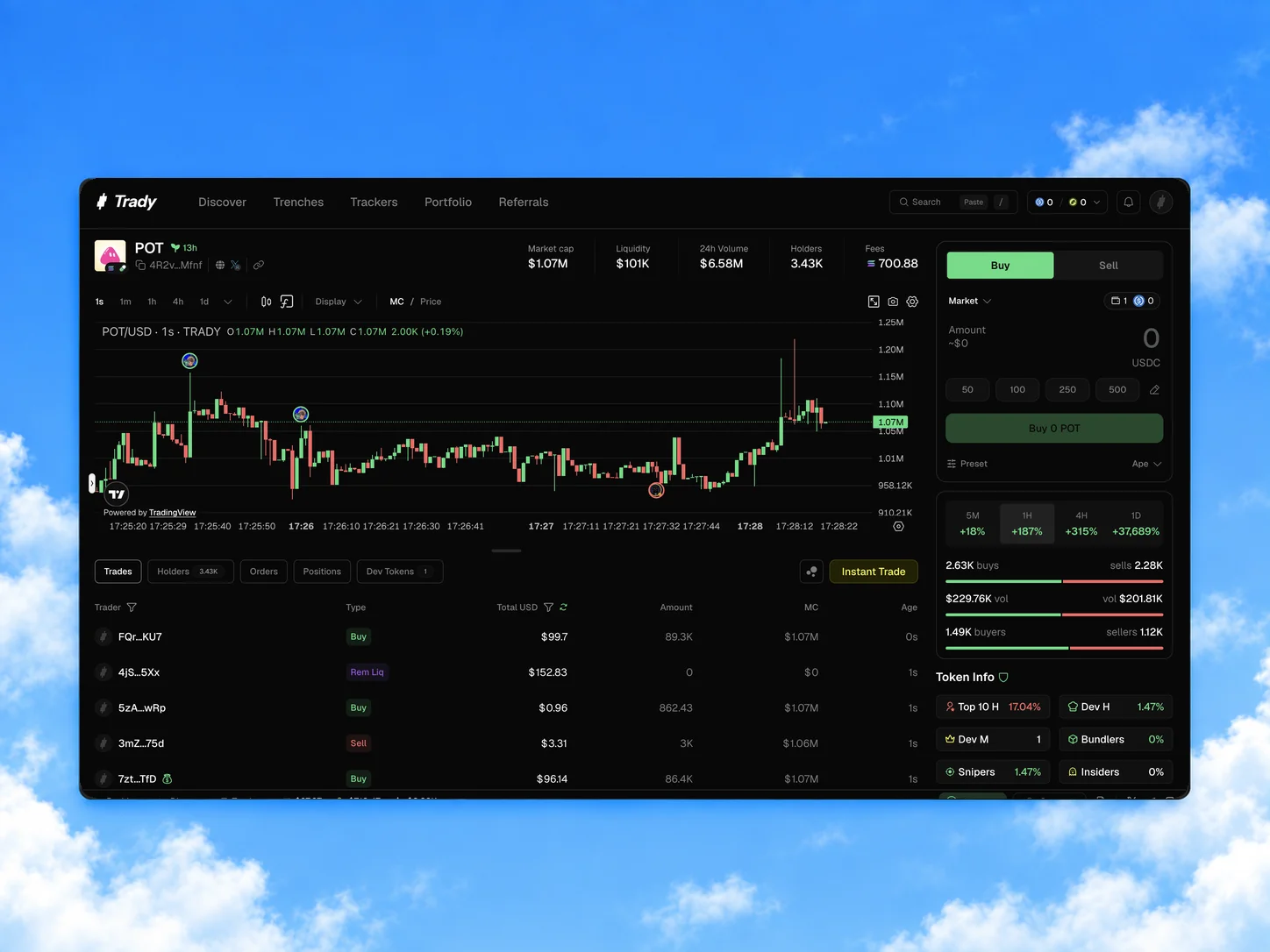
02 — Trade: giving chart analysis and execution clearer priority
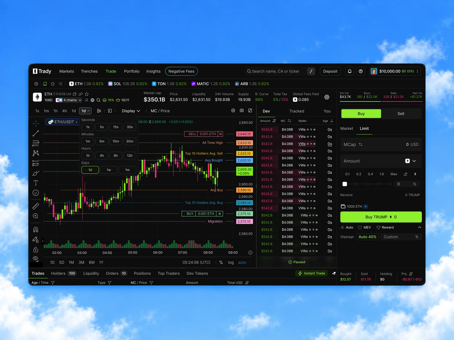
The chart competed for space with a separate activity column, the order form, a long token-summary row, and multiple overlays.
A more selective token summary and clearer grouping around order entry, risk information, and activity — analysis, execution, and context no longer compete for the same space. On mobile, Security Audit moves into a bottom sheet instead of sitting on the chart permanently.
A wider chart, a leaner summary, and a hierarchy that gives analysis room to breathe.
03 — Clarifying cross-chain activity
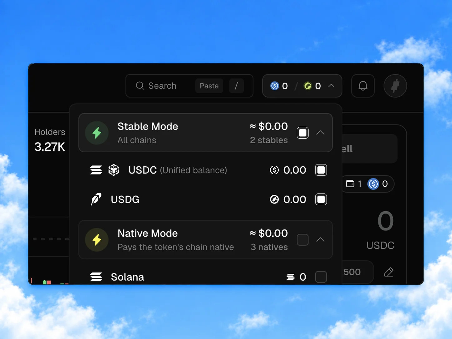
Traders had to leave Trady for an external bridge just to check which chain held their funds.
Total buying power and its chain-level breakdown live together, with cross-chain movement inside the product — an overall balance alone doesn't say what's tradeable on a given chain.
Balance checking and funding stay inside the trading workflow — no detour to a separate bridge interface.
V2 translated a narrower product focus into a more specialised discovery and trading interface, implemented across both desktop and mobile:
Comparable post-launch analytics weren't available, so I'm not claiming a measured improvement from these shipped changes — see the synthetic evaluation below for how I approached validation instead.
To prepare for real-user testing, I ran an AI-assisted synthetic evaluation of V1 and V2 using six simulated trader profiles — the same task each time (find a token, check liquidity and top-holder concentration, prepare a 100 USDC buy without submitting), reviewed against screenshots and Figma designs. No real participants were involved.
Constructed scenarios, not measured user behaviour — the point was to make assumptions explicit and find what to test next.
The exercise produced three hypotheses for real testing: individual token indicators may support evaluation, clearer grouping may help order preparation, and compact execution presets may need extra checking for experienced traders. Next: clarify holder-risk definitions and the preparing/submitting boundary, then test both versions with real traders.